
By Stephanie Miller, Marketing Coordinator

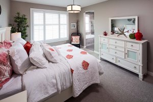
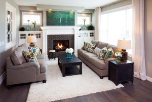
Once our home buyers have decided on all their interior selections such as cabinetry, countertops, flooring and finishings, our Design Consultants help them select a paint colour that will tie all these selections together and complement any furnishings they have. When our home buyers open the paint fan and see that there are hundreds of standard white-based paint colours to choose from, the decision becomes overwhelming. With such an array of options, you’d think that we are seeing walls painted every colour under the rainbow. Well, I bet you’d be surprised to hear that over the last year, about 90% of our home buyers have all gravitated towards the same top five paint colours!
Here’s a look at our Design Center’s top 5 General Paint wall colours:
Sibbald (CLW 1036W)

This colour is incredibly versatile as it’s neutral and light and looks great when paired with either grey or taupe selections. When homeowners have selected a grey palette in their home, our Design Consultants suggest Sibbald if the homeowner wants to avoid grey paints that have blue undertones.
Trans Canada Highway (CH069)
If you’re looking for a paint colour with a taupe-grey undertone to it, Trans Canada Highway is a great colour to select. This colour is also selected when homeowners are wanting walls with a little more depth to the colour.
Siberia (CL 2852W)
Siberia is another lighter colour that tends to pair well with both taupe and brown selections.
Tracing Paper (CL 2862W)
If your interior selections are more on the taupey hues, Tracing Paper is a great paint colour to choose that is very neutral.
Keratin (CL 2863W)
Keratin is right beside Tracing Paper on the paint palette and although it’s a white based paint, it seems to have a little more depth to it. It works very well with taupe interior selections.
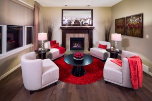
Overall you can see that the current paint colour trends are light neutral paint colours that will complement the interior selections or furniture in your home rather than command too much attention. Another big trend we’re seeing this year is selecting the same wall and trim colour. White on white in the décor world is huge! To achieve this we recommend using General Paint’s Arctic White CH123. Our Design Consultant, Sandi, even integrated this new trend into our new Auburn Bay Huxley showhome that opened in June 2015.

So whether you’re in the process of designing a home, repainting a room or selling a home and looking to add a fresh coat of paint on the walls, our Design Consultants recommend these great options!
Have a great weekend,
Cedarglen Marketing

It’s funny how people gravitate towards the same colors. Those are really great options for the new neutral gray trend. Thanks for sharing
Thanks Alexandra! I agree that it’s funny to see out of so many choices, everyone seems to pick out the same favorites!